
Women’s Influence Network
Making connection and resources easier to find.
Squarespace website.
View Live Site

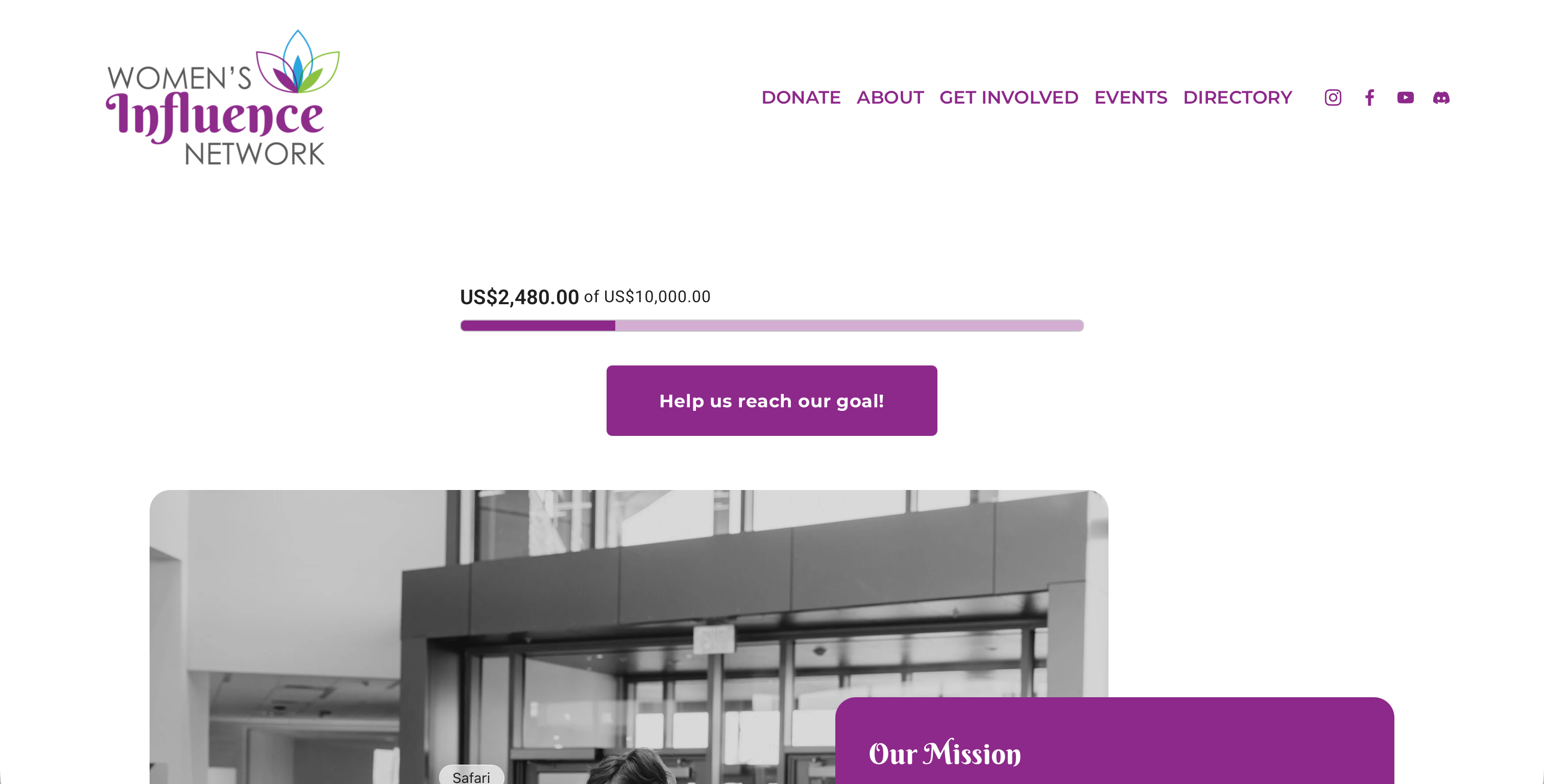
Project Overview
Project BriefDesign a responsive website for a local nonprofit.
Timeline
2021 - present
Role
UX, Web Designer, Board Member
Platform
Squarespace
01 // THE CONTEXT
Understanding the Problem & Defining the Vision
After separating from the Chamber, WIN needed to establish an independent digital presence that could communicate its mission, connect its community, and support its growth as a new nonprofit.
The Core Problem
WIN needed to establish a new digital home after separating from the organization that had originally housed it.
The Goal
Create a clear, accessible website that introduced WIN’s mission, connected women to opportunities and events, and made it easy for the community to get involved.
Key Solution Highlights
Communicate the Mission
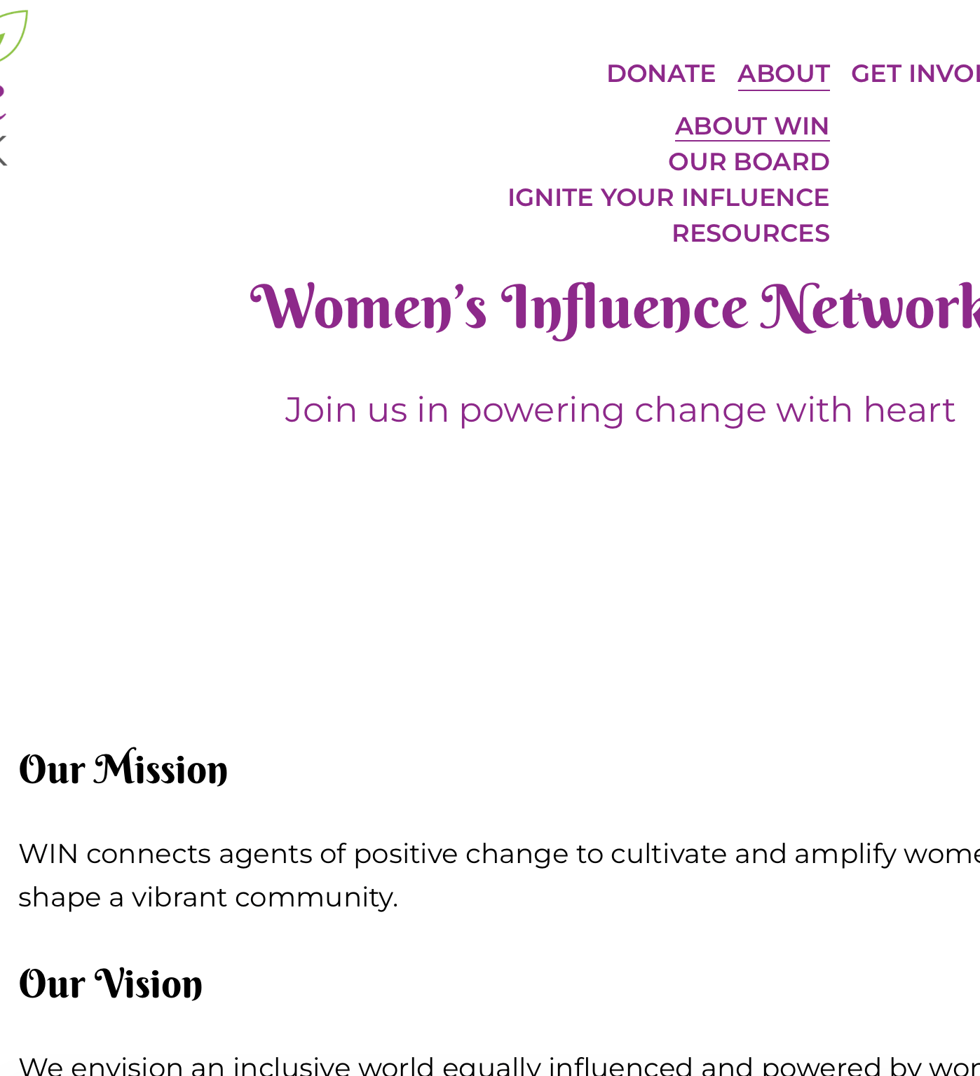
A clear ‘About’ experience introduced WIN’s mission, vision, values, and purpose, helping new visitors understand what the organization is and why it exists. The current site explicitly foregrounds its mission and core principles.
Connect Through Events
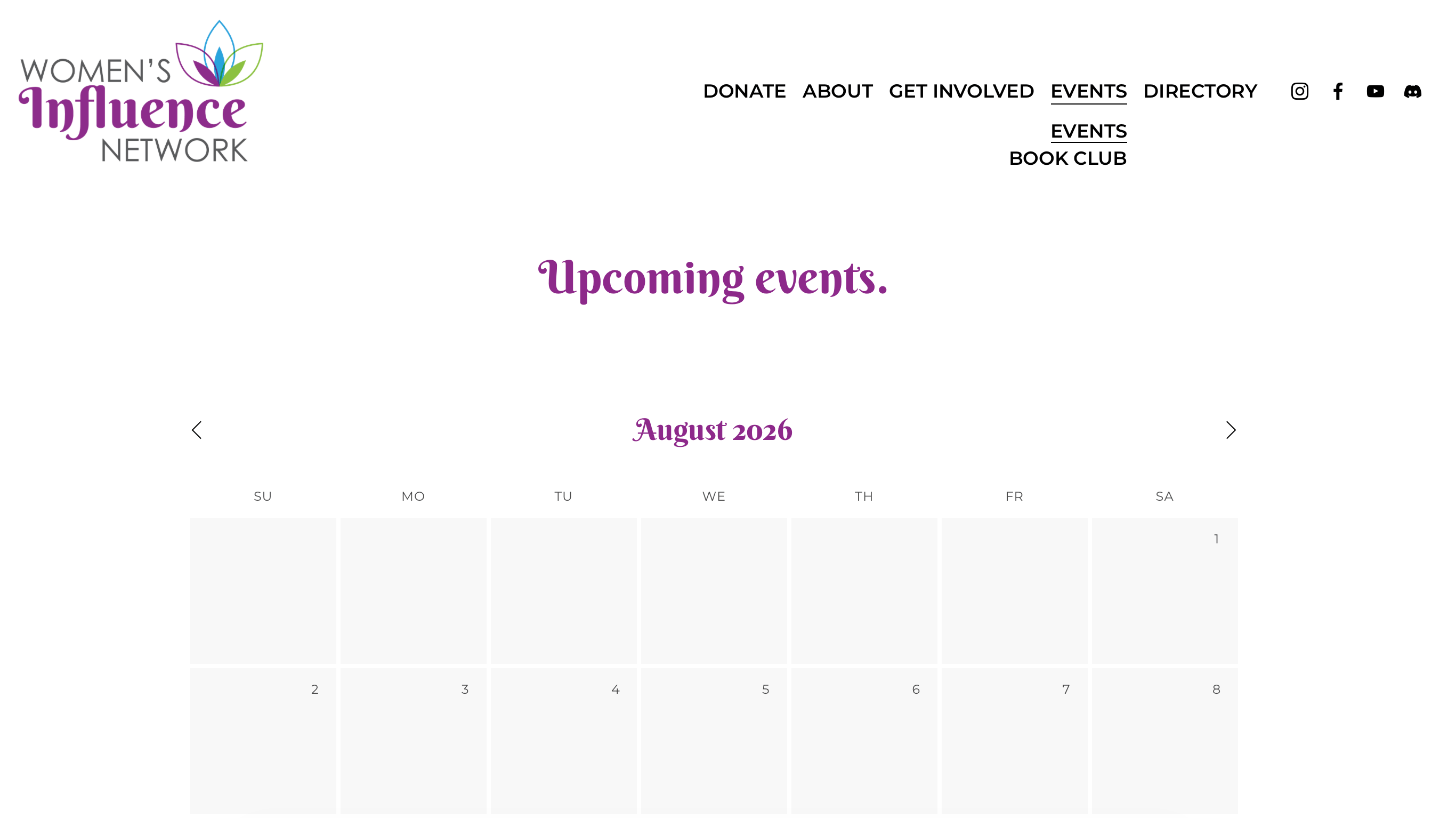
An ‘events’ experience made it easy for visitors to discover upcoming opportunities to learn, connect, and participate. The current site puts upcoming events prominently on the homepage and provides a path to view all events.
Create Paths to Get Involved
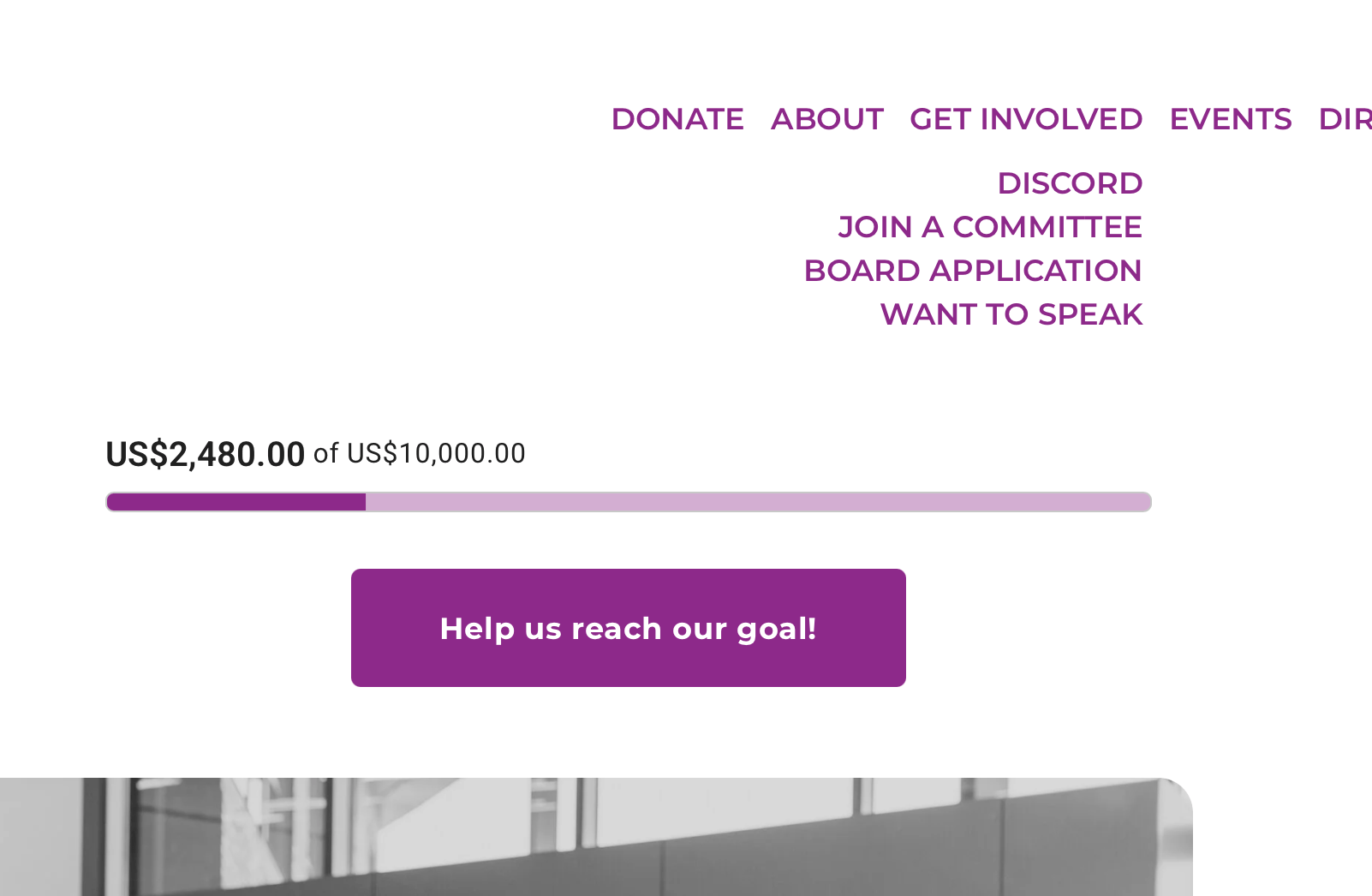
Multiple pathways let visitors participate according to their level of involvement, from joining the Discord community to joining a committee, applying for the board, speaking at an event, or making a donation.
02 // THE BRAND
The Visual System
Expanding an established identity for greater flexibility and accessibility.
Working Within an Established Brand
WIN already had an established visual identity when I joined the organization. Rather than replacing the existing brand, I worked within its established colors, typography, and visual personality to create a cohesive digital experience. Applying the brand to a website also revealed opportunities to make the system more flexible and accessible.
Accessibility Constraints
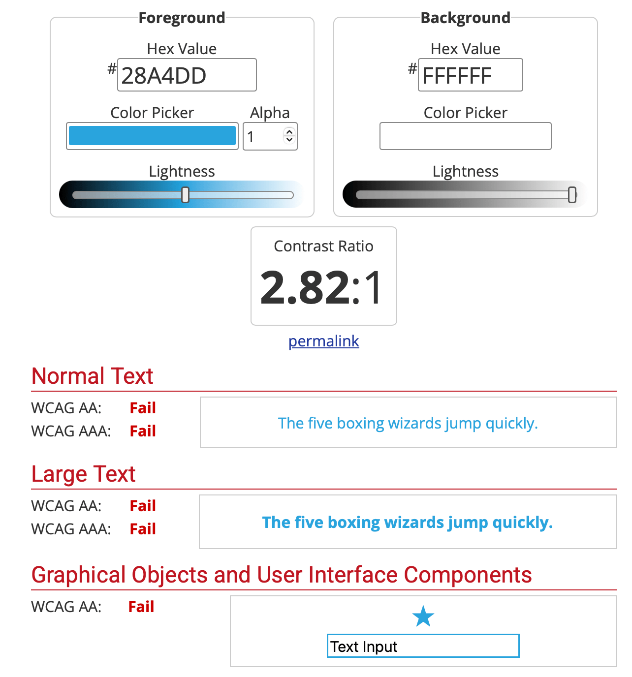
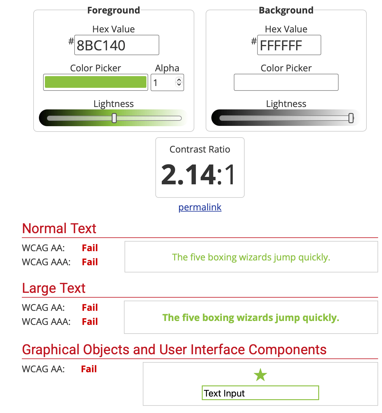
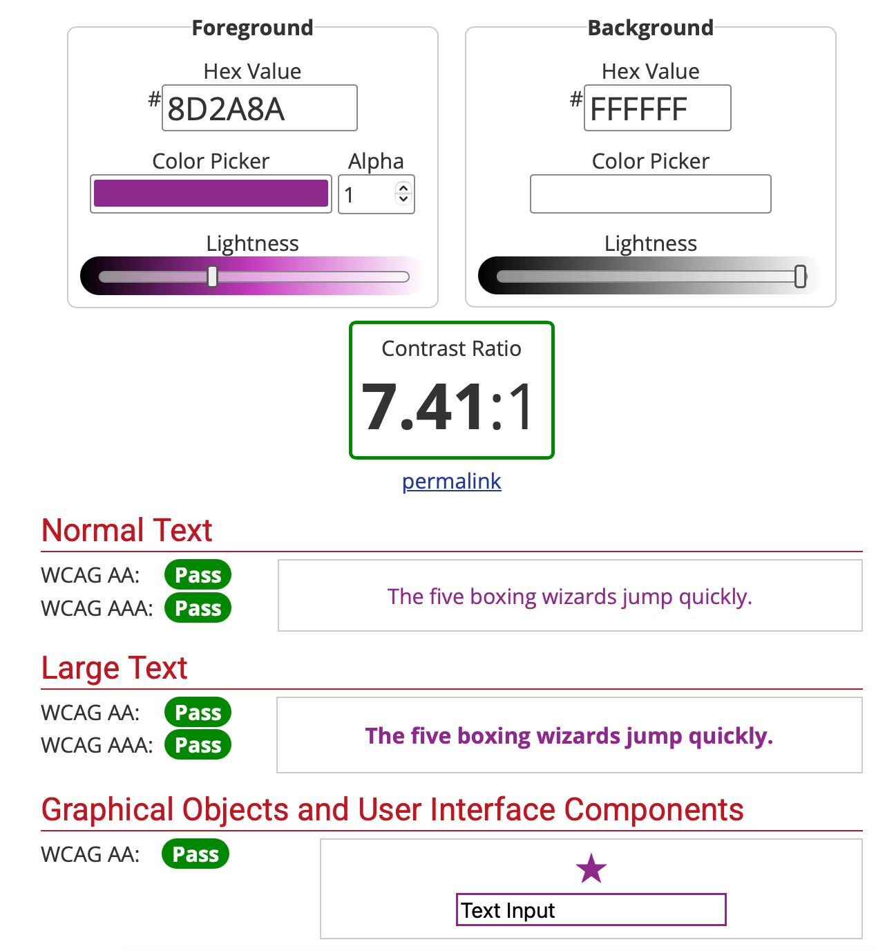
The existing color palette presented an immediate accessibility challenge. Of WIN’s three primary brand colors, only the purple provided sufficient contrast for use as a primary text or background color across the combinations I tested. The other colors could still contribute to the visual identity, but their use needed to be limited to smaller accents and decorative elements.
This became an important consideration not only for the website, but for WIN's broader digital presence. Consistent accessibility requires a visual system with enough flexibility to support different backgrounds, text, and content types.
Typography
WIN’s established typography also presented some practical limitations. Berkshire Swash adds personality to the brand, but its decorative letterforms make it difficult to use for longer passages, smaller text, all caps, and information-heavy content.
I primarily use Century Gothic Pro for digital content because its simpler forms provide better readability while still complementing the existing brand. Berkshire Swash remains useful as a display typeface where its personality can add emphasis without compromising readability.
Expanding the Brand System
Rather than pursuing a rebrand, WIN is now working to expand the existing brand system. The goal is to preserve the identity and visual elements that are meaningful to the organization while giving the brand more flexibility for digital and print applications.
I’m leading this ongoing effort with WIN’s current chair and support from interested committee members. Our initial priorities are expanding the existing color palette with accessible tints and shades and introducing an additional typeface set designed for greater readability and flexibility across graphic design platforms.
The result will be a more flexible system that can maintain WIN’s recognizable identity while giving the organization more accessible and practical tools for communicating across platforms.
Project Reflection
WIN taught me that UX doesn't happen in a vacuum. Designing for a growing organization meant balancing user needs with existing brand decisions, organizational history, and practical constraints. The project helped me recognize opportunities beyond the immediate website and led to my ongoing work to make WIN's visual system more flexible and accessible.


Women’s Influence Network
Making connection and resources easier to find.
Squarespace website.
View Live Site
Project Overview
Project BriefDesign a responsive website for a local nonprofit.
Timeline
2021 - present
Role
UX, Web Designer, Board Member
Platform
Squarespace
01 // THE CONTEXT
Understanding the Problem & Defining the Vision
After separating from the Chamber, WIN needed to establish an independent digital presence that could communicate its mission, connect its community, and support its growth as a new nonprofit.
The Core Problem
WIN needed to establish a new digital home after separating from the organization that had originally housed it.
The Goal
Create a clear, accessible website that introduced WIN’s mission, connected women to opportunities and events, and made it easy for the community to get involved.
Key Solution Highlights
Communicate the Mission
A clear ‘About’ experience introduced WIN’s mission, vision, values, and purpose, helping new visitors understand what the organization is and why it exists. The current site explicitly foregrounds its mission and core principles.
Connect Through Events
An ‘events’ experience made it easy for visitors to discover upcoming opportunities to learn, connect, and participate. The current site puts upcoming events prominently on the homepage and provides a path to view all events.
Create Paths to Get Involved
Multiple pathways let visitors participate according to their level of involvement, from joining the Discord community to joining a committee, applying for the board, speaking at an event, or making a donation.
02 // THE BRAND
The Visual System
Expanding an established identity for greater flexibility and accessibility.
Working Within an Established Brand
WIN already had an established visual identity when I joined the organization. Rather than replacing the existing brand, I worked within its established colors, typography, and visual personality to create a cohesive digital experience. Applying the brand to a website also revealed opportunities to make the system more flexible and accessible.
Accessibility Constraints
The existing color palette presented an immediate accessibility challenge. Of WIN’s three primary brand colors, only the purple provided sufficient contrast for use as a primary text or background color across the combinations I tested. The other colors could still contribute to the visual identity, but their use needed to be limited to smaller accents and decorative elements.
This became an important consideration not only for the website, but for WIN's broader digital presence. Consistent accessibility requires a visual system with enough flexibility to support different backgrounds, text, and content types.
Typography
WIN’s established typography also presented some practical limitations. Berkshire Swash adds personality to the brand, but its decorative letterforms make it difficult to use for longer passages, smaller text, all caps, and information-heavy content.
I primarily use Century Gothic Pro for digital content because its simpler forms provide better readability while still complementing the existing brand. Berkshire Swash remains useful as a display typeface where its personality can add emphasis without compromising readability.
Expanding the Brand System
Rather than pursuing a rebrand, WIN is now working to expand the existing brand system. The goal is to preserve the identity and visual elements that are meaningful to the organization while giving the brand more flexibility for digital and print applications.
I’m leading this ongoing effort with WIN’s current chair and support from interested committee members. Our initial priorities are expanding the existing color palette with accessible tints and shades and introducing an additional typeface set designed for greater readability and flexibility across graphic design platforms.
The result will be a more flexible system that can maintain WIN’s recognizable identity while giving the organization more accessible and practical tools for communicating across platforms.
Project Reflection
WIN taught me that UX doesn't happen in a vacuum. Designing for a growing organization meant balancing user needs with existing brand decisions, organizational history, and practical constraints. The project helped me recognize opportunities beyond the immediate website and led to my ongoing work to make WIN's visual system more flexible and accessible.

Women’s Influence Network
Making connection and resources easier to find.
Squarespace website.
View Live Site
Project Overview
Project BriefDesign a responsive website for a local nonprofit.
Timeline
2021 - present
Role
UX, Web Designer, Board Member
Platform
Squarespace
01 // THE CONTEXT
Understanding the Problem & Defining the Vision
After separating from the Chamber, WIN needed to establish an independent digital presence that could communicate its mission, connect its community, and support its growth as a new nonprofit.
The Core Problem
WIN needed to establish a new digital home after separating from the organization that had originally housed it.
The Goal
Create a clear, accessible website that introduced WIN’s mission, connected women to opportunities and events, and made it easy for the community to get involved.
Key Solution Highlights
Communicate the Mission
A clear ‘About’ experience introduced WIN’s mission, vision, values, and purpose, helping new visitors understand what the organization is and why it exists. The current site explicitly foregrounds its mission and core principles.
Connect Through Events
An ‘events’ experience made it easy for visitors to discover upcoming opportunities to learn, connect, and participate. The current site puts upcoming events prominently on the homepage and provides a path to view all events.
Create Paths to Get Involved
Multiple pathways let visitors participate according to their level of involvement, from joining the Discord community to joining a committee, applying for the board, speaking at an event, or making a donation.
02 // THE BRAND
The Visual System
Expanding an established identity for greater flexibility and accessibility.
Working Within an Established Brand
WIN already had an established visual identity when I joined the organization. Rather than replacing the existing brand, I worked within its established colors, typography, and visual personality to create a cohesive digital experience. Applying the brand to a website also revealed opportunities to make the system more flexible and accessible.
Accessibility Constraints
The existing color palette presented an immediate accessibility challenge. Of WIN’s three primary brand colors, only the purple provided sufficient contrast for use as a primary text or background color across the combinations I tested. The other colors could still contribute to the visual identity, but their use needed to be limited to smaller accents and decorative elements.
This became an important consideration not only for the website, but for WIN's broader digital presence. Consistent accessibility requires a visual system with enough flexibility to support different backgrounds, text, and content types.
Typography
WIN’s established typography also presented some practical limitations. Berkshire Swash adds personality to the brand, but its decorative letterforms make it difficult to use for longer passages, smaller text, all caps, and information-heavy content.
I primarily use Century Gothic Pro for digital content because its simpler forms provide better readability while still complementing the existing brand. Berkshire Swash remains useful as a display typeface where its personality can add emphasis without compromising readability.
Expanding the Brand System
Rather than pursuing a rebrand, WIN is now working to expand the existing brand system. The goal is to preserve the identity and visual elements that are meaningful to the organization while giving the brand more flexibility for digital and print applications.
I’m leading this ongoing effort with WIN’s current chair and support from interested committee members. Our initial priorities are expanding the existing color palette with accessible tints and shades and introducing an additional typeface set designed for greater readability and flexibility across graphic design platforms.
The result will be a more flexible system that can maintain WIN’s recognizable identity while giving the organization more accessible and practical tools for communicating across platforms.
Project Reflection
WIN taught me that UX doesn't happen in a vacuum. Designing for a growing organization meant balancing user needs with existing brand decisions, organizational history, and practical constraints. The project helped me recognize opportunities beyond the immediate website and led to my ongoing work to make WIN's visual system more flexible and accessible.