
Plantera
Plant care made less overwhelming.
Google UX Design Certification Project.
Project Overview
Project BriefDesign an app and responsive website that help customers diagnose issues with their houseplants.
Timeline
January 2025 – August 2025
Role
UX Researcher & Designer
Project Type
Individual project - Google UX Design Certificate
Approach
User research - Problem definition - Ideation - Competitive Audit - Wireframing - Usability testing - Iteration - Prototyping
Focus
Plant diagnosis - Information architecture - User flows - Usability - Accessibility
Deliverables
Mobile app - Responsive website - Interactive prototypes
01 // THE CONTEXT
Understanding the Problem & Defining the Vision
Plantera was created as an end-to-end UX project focused on helping people diagnose issues with their houseplants and save useful care information to a personal journal.
The Core Problem
Beginner plant parents want to learn the basics of plant care, but there’s a lot of information and it can feel overwhelming.
The Goal
Design an app to help beginner plant parents easily diagnose their plant issues, provide care guides, and basic plant care articles.
Key Solution Highlights
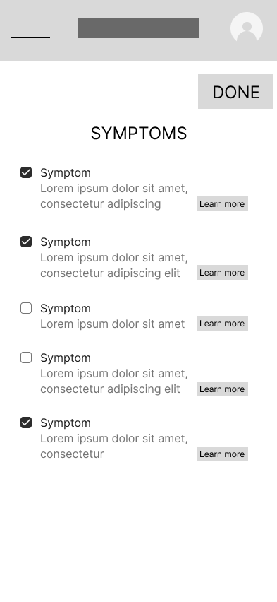
Diagnosis Checklist
Guide users through identifying symptoms affecting their plant.
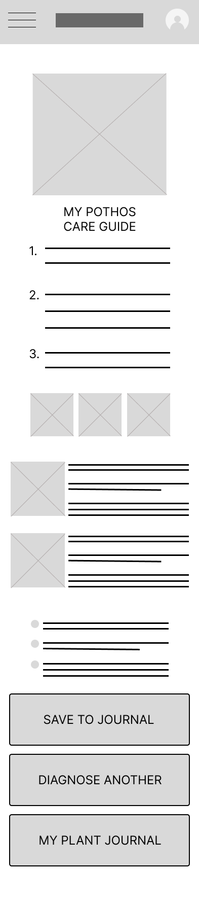
Actionable Care Guide
Present diagnostic information and care recommendations in a clear, scannable format.
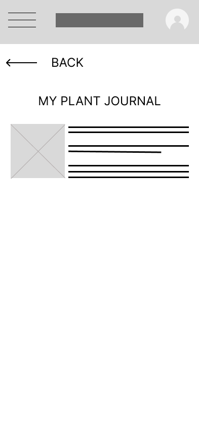
Plant Journal
Give users a place to save plant information and care guides for future reference.
02 // THE USER
Understanding the User
Pain Points
Conflicting Info
Frustrated when plants show signs of distress and find conflicting information online when trying to figure it out.
Limited Time
Busy schedules mean not enough time to care for plants or research problems.
Plants Not Thriving
Despite best efforts, plants not thriving. Challenging to find right plants for their environment and lifestyle.
Past Failures
Overwhelmed by thought of adding more plants due to past struggles. Feels like a bad plant parent.
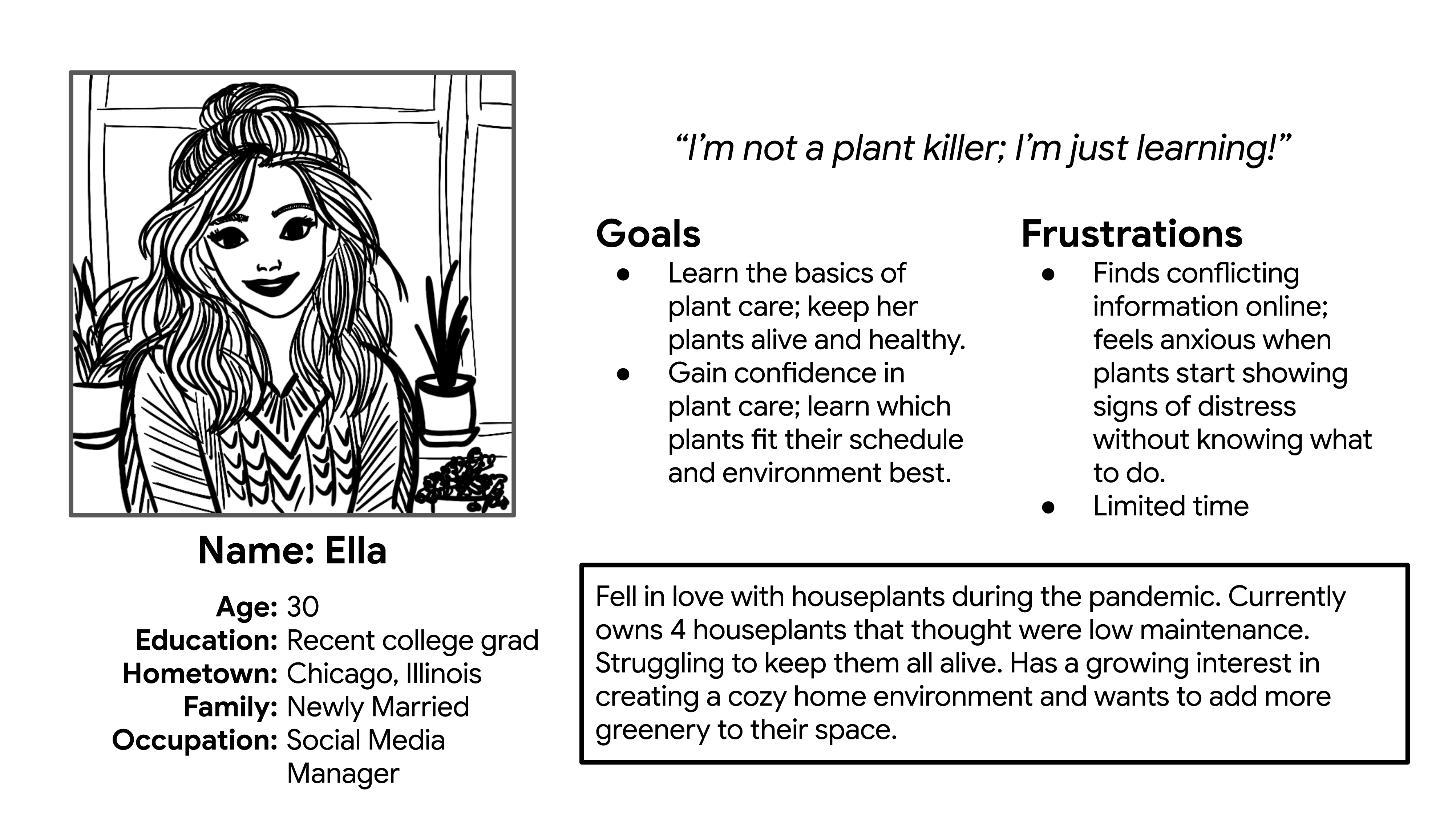
User Persona
Mapping the Experience
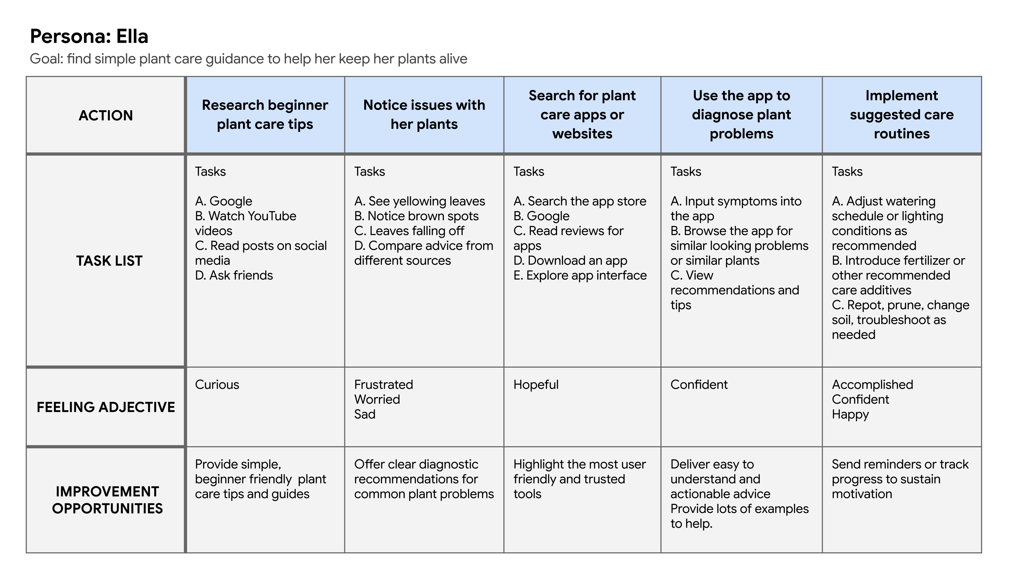
Journey Map
User Flow
Storyboards
03 // THE DESIGN
Starting the Design
Paper Wireframes For Homepage
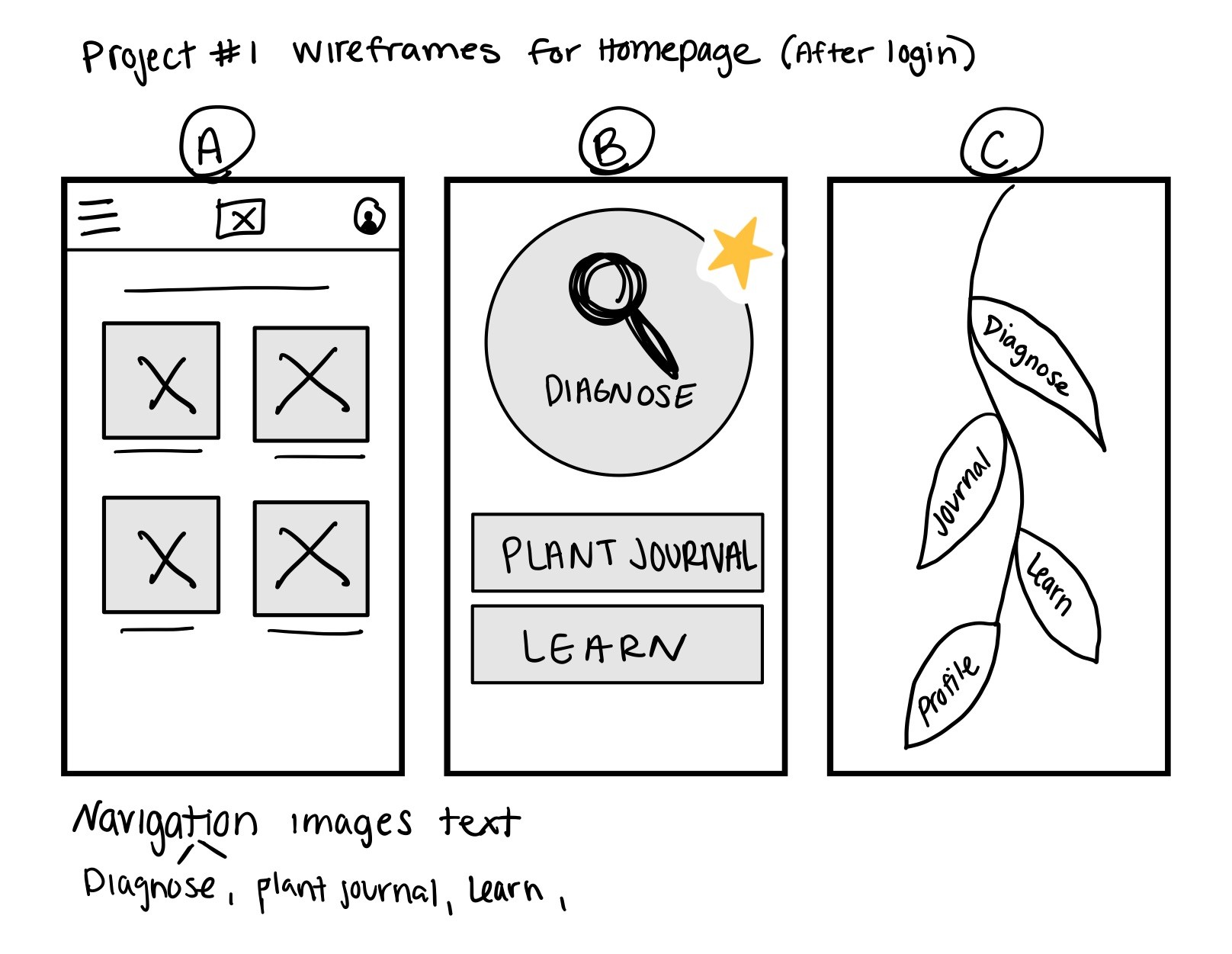
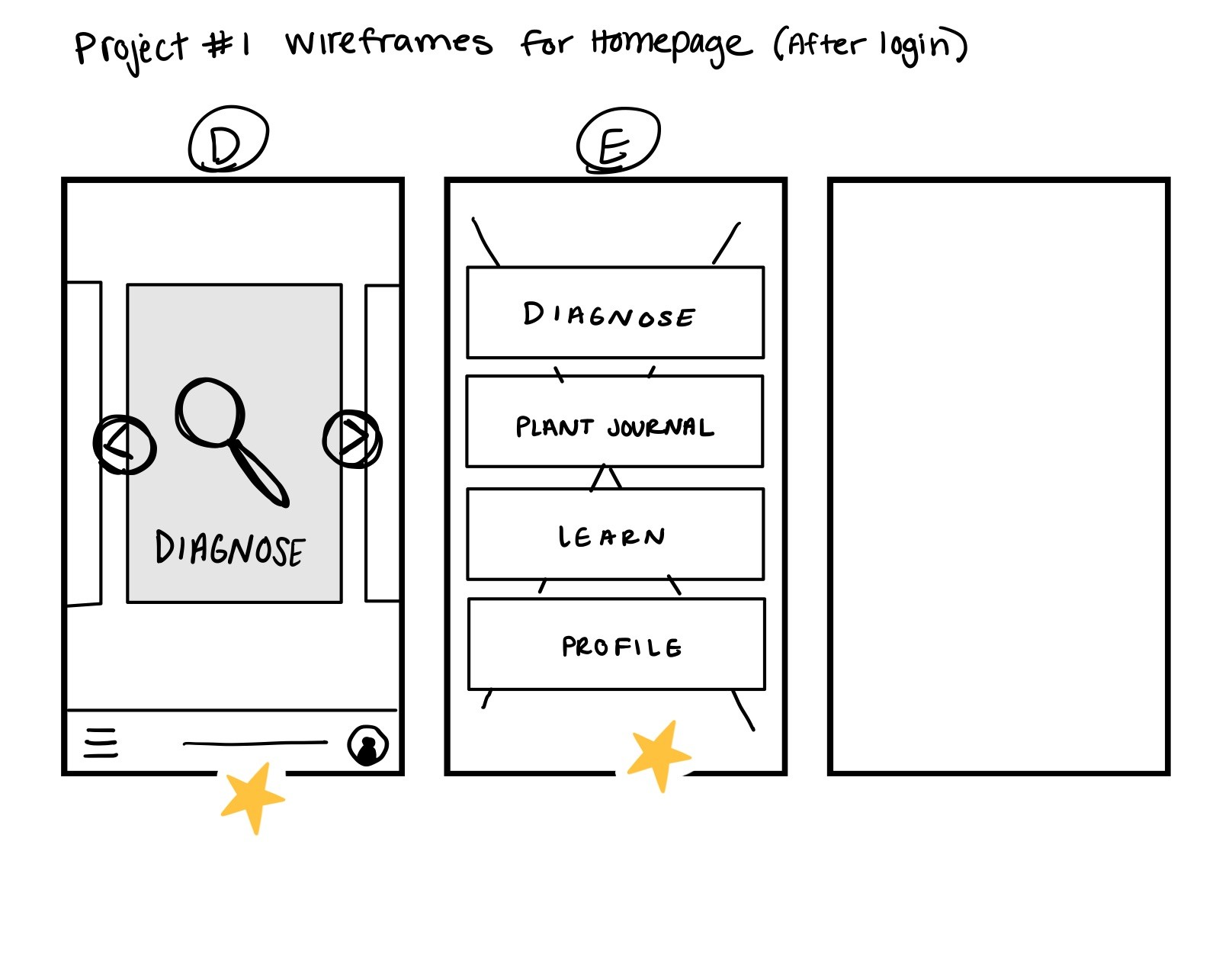
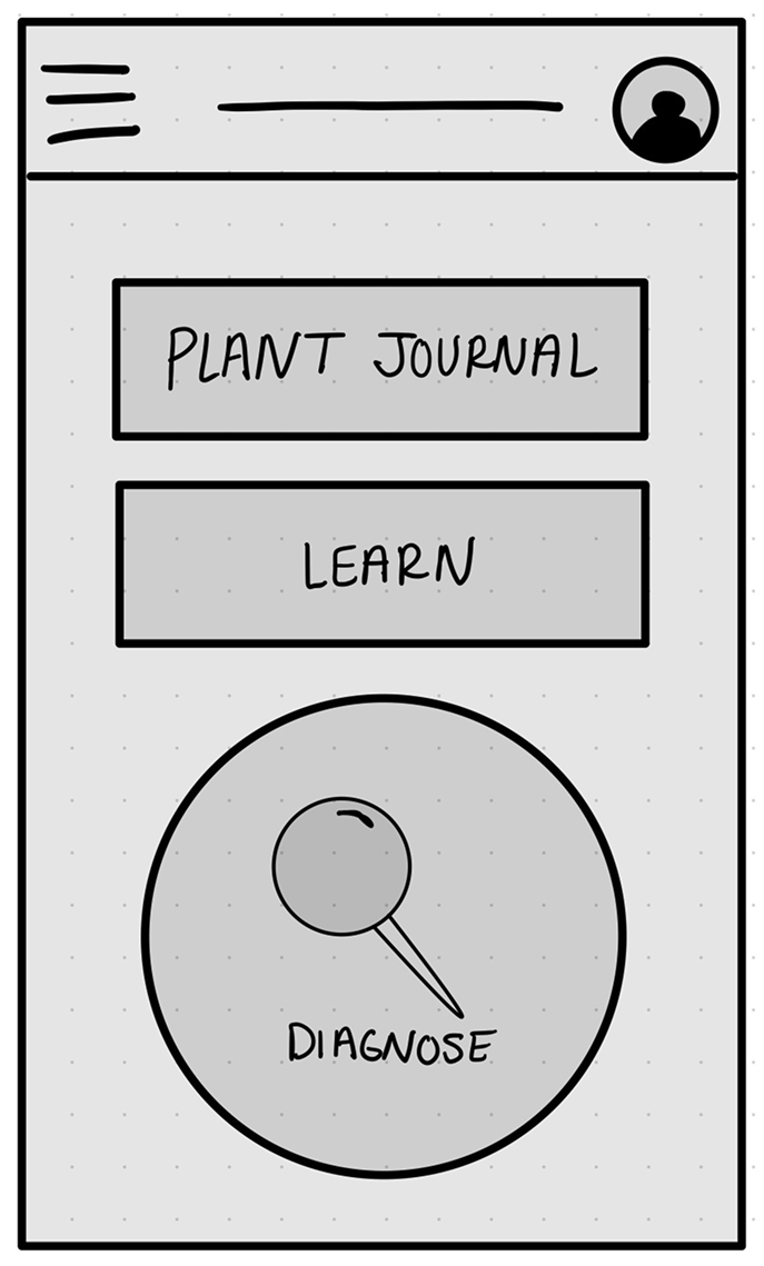
Digital Wireframes
Usability Study: Round 1
Conducted a moderated usability study with 5 participants.
Research goal:
to figure out what specific difficulties users encounter when they try to complete the core tasks of the plant diagnosing app: diagnose a plant, find their plant, access care guides, save to journal
01
Users afraid of hitting “done”. They felt uncertain if progress saved.
Insight: create more clarifying language for that step.
02
Users expressed wanting more help diagnosing plants.
Insight: Design additional helpful screens and overlays to help guide the user through the diagnose flow.
03
Users felt there was too much info displayed at once.
Insight: Segment the data so it’s easier to digest and scan.
04 // ITERATE
Iterating the Design
Low Fidelity Prototype
Usability Study: Round 2
Conducted a moderated usability study with 5 participants.
Research goal:
to figure out what specific difficulties users encounter when they try to complete the core tasks of the plant diagnosing app: diagnose a plant, find their plant, access care guides, save to journal, then browse the learn guides.
01
Users had difficulty navigating the app.
Insight: design a recognizable bar to help them navigate the app better.
02
Users felt intimidated by the large buttons and multiple CTA’s on journal page.
Insight: Design a FAB for the diagnose function. Remove competing CTA’s. Create a “saved” automatic pop-up when users reach this stage.
03
Users mentioned they weren’t certain what would happen if they selected “learn” on the homepage.
Insight: Incorporate the “learn” page into the navigation and add an icon to assist. Add personalization to the homepage.
High-fidelity Prototypes
05 // ACCESSIBILITY
Accessibility Considerations
UI Contrast
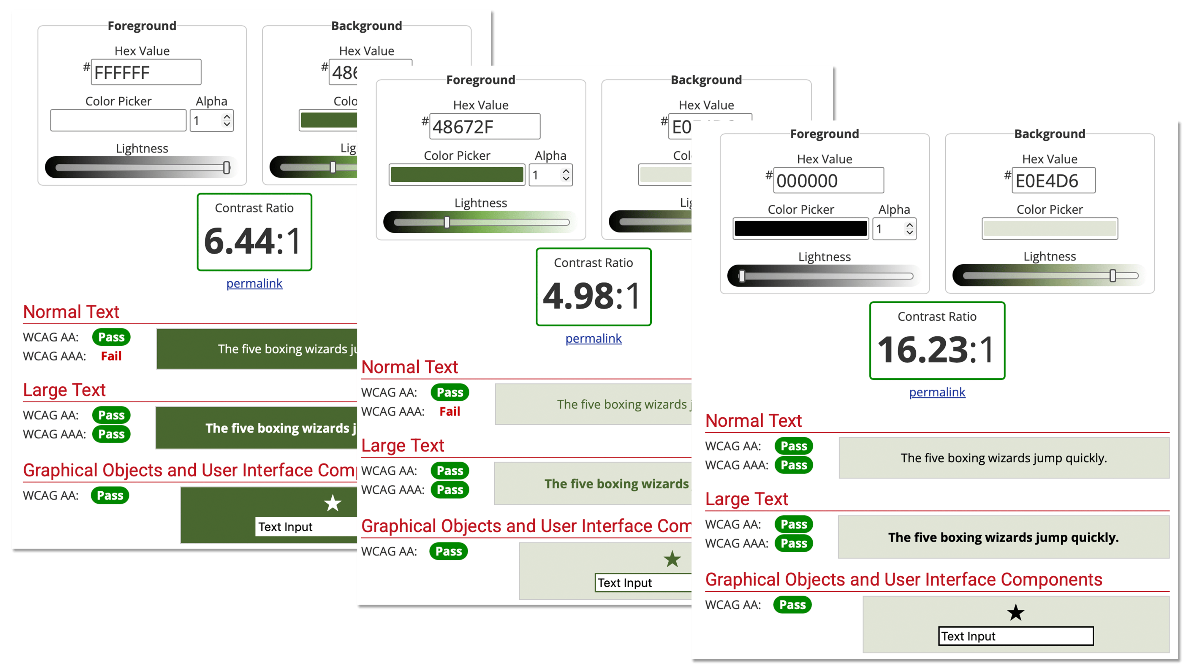
Interface components and meaningful visual elements were tested to ensure sufficient contrast.
Color & Text Contrast
Colors were tested using WebAIM’s Contrast Checker to ensure text meets WCAG AA or higher.
Typography
Limited the interface to two typefaces, using Source Sans primarily for interface and body text to support readability. Source Serif provides visual distinction for select headings.
Clear Interaction States
Buttons and interactive elements provide visual feedback when pressed or selected, while navigation highlights the user’s current location.
Icons + Labels
Navigation combines icons with text labels so users don’t have to rely on icon recognition alone.
Information Hierarchy
Clear typographic hierarchy and structured, scannable layouts make longer content, such as the care guide, easier to navigate and digest.
Project Reflection
Plantera gave me the opportunity to take a project from initial research through usability testing, iteration, and final design. The process reinforced the importance of testing assumptions early and using user feedback to simplify and strengthen an experience.


Plantera
Plant care made less overwhelming.
Google UX Design Certification Project.
Project Overview
Project BriefDesign an app and responsive website that help customers diagnose issues with their houseplants.
Timeline
January 2025 – August 2025
Role
UX Researcher & Designer
Project Type
Individual project - Google UX Design Certificate
Approach
User research - Problem definition - Ideation - Competitive Audit - Wireframing - Usability testing - Iteration - Prototyping
Focus
Plant diagnosis - Information architecture - User flows - Usability - Accessibility
Deliverables
Mobile app - Responsive website - Interactive prototypes
01 // THE CONTEXT
Understanding the Problem & Defining the Vision
Plantera was created as an end-to-end UX project focused on helping people diagnose issues with their houseplants and save useful care information to a personal journal.
The Core Problem
Beginner plant parents want to learn the basics of plant care, but there’s a lot of information and it can feel overwhelming.
The Goal
Design an app to help beginner plant parents easily diagnose their plant issues, provide care guides, and basic plant care articles.
Key Solution Highlights
Diagnosis Checklist
Guide users through identifying symptoms affecting their plant.
Actionable Care Guide
Present diagnostic information and care recommendations in a clear, scannable format.
Plant Journal
Give users a place to save plant information and care guides for future reference.
02 // THE USER
Understanding the User
Pain Points
Conflicting Info
Frustrated when plants show signs of distress and find conflicting information online when trying to figure it out.
Limited Time
Busy schedules mean not enough time to care for plants or research problems.
Plants Not Thriving
Despite best efforts, plants not thriving. Challenging to find right plants for their environment and lifestyle.
Past Failures
Overwhelmed by thought of adding more plants due to past struggles. Feels like a bad plant parent.
User Persona
Mapping the Experience
Journey Map
User Flow
Storyboards
03 // THE DESIGN
Starting the Design
Paper Wireframes For Homepage
Digital Wireframes
Usability Study: Round 1
Conducted a moderated usability study with 5 participants.
Research goal:
to figure out what specific difficulties users encounter when they try to complete the core tasks of the plant diagnosing app: diagnose a plant, find their plant, access care guides, save to journal
01
Users afraid of hitting “done”. They felt uncertain if progress saved.
Insight: create more clarifying language for that step.
02
Users expressed wanting more help diagnosing plants.
Insight: Design additional helpful screens and overlays to help guide the user through the diagnose flow.
03
Users felt there was too much info displayed at once.
Insight: Segment the data so it’s easier to digest and scan.
04 // ITERATE
Iterating the Design
Low Fidelity Prototype
Usability Study: Round 2
Conducted a moderated usability study with 5 participants.
Research goal:
to figure out what specific difficulties users encounter when they try to complete the core tasks of the plant diagnosing app: diagnose a plant, find their plant, access care guides, save to journal, then browse the learn guides.
01
Users had difficulty navigating the app.
Insight: design a recognizable bar to help them navigate the app better.
02
Users felt intimidated by the large buttons and multiple CTA’s on journal page.
Insight: Design a FAB for the diagnose function. Remove competing CTA’s. Create a “saved” automatic pop-up when users reach this stage.
03
Users mentioned they weren’t certain what would happen if they selected “learn” on the homepage.
Insight: Incorporate the “learn” page into the navigation and add an icon to assist. Add personalization to the homepage.
High-fidelity Prototypes
05 // ACCESSIBILITY
Accessibility Considerations
UI Contrast
Interface components and meaningful visual elements were tested to ensure sufficient contrast.
Color & Text Contrast
Typography
Limited the interface to two typefaces, using Source Sans primarily for interface and body text to support readability. Source Serif provides visual distinction for select headings.
Clear Interaction States
Buttons and interactive elements provide visual feedback when pressed or selected, while navigation highlights the user’s current location.
Icons + Labels
Navigation combines icons with text labels so users don’t have to rely on icon recognition alone.
Information Hierarchy
Clear typographic hierarchy and structured, scannable layouts make longer content, such as the care guide, easier to navigate and digest.
Project Reflection
Plantera gave me the opportunity to take a project from initial research through usability testing, iteration, and final design. The process reinforced the importance of testing assumptions early and using user feedback to simplify and strengthen an experience.

Plantera
Plant care made less overwhelming.
Google UX Design Certification Project.
Project Overview
Project BriefDesign an app and responsive website that help customers diagnose issues with their houseplants.
Timeline
January 2025 – August 2025
Role
UX Researcher & Designer
Project Type
Individual project - Google UX Design Certificate
Approach
User research - Problem definition - Ideation - Competitive Audit - Wireframing - Usability testing - Iteration - Prototyping
Focus
Plant diagnosis - Information architecture - User flows - Usability - Accessibility
Deliverables
Mobile app - Responsive website - Interactive prototypes
01 // THE CONTEXT
Understanding the Problem & Defining the Vision
Plantera was created as an end-to-end UX project focused on helping people diagnose issues with their houseplants and save useful care information to a personal journal.
The Core Problem
Beginner plant parents want to learn the basics of plant care, but there’s a lot of information and it can feel overwhelming.
The Goal
Design an app to help beginner plant parents easily diagnose their plant issues, provide care guides, and basic plant care articles.
Key Solution Highlights
Diagnosis Checklist
Guide users through identifying symptoms affecting their plant.
Actionable Care Guide
Present diagnostic information and care recommendations in a clear, scannable format.
Plant Journal
Give users a place to save plant information and care guides for future reference.
02 // THE USER
Understanding the User
Pain Points
Conflicting Info
Frustrated when plants show signs of distress and find conflicting information online when trying to figure it out.
Limited Time
Busy schedules mean not enough time to care for plants or research problems.
Plants Not Thriving
Despite best efforts, plants not thriving. Challenging to find right plants for their environment and lifestyle.
Past Failures
Overwhelmed by thought of adding more plants due to past struggles. Feels like a bad plant parent.
User Persona
Mapping the Experience
Journey Map
User Flow
Storyboards
03 // THE DESIGN
Starting the Design
Paper Wireframes For Homepage
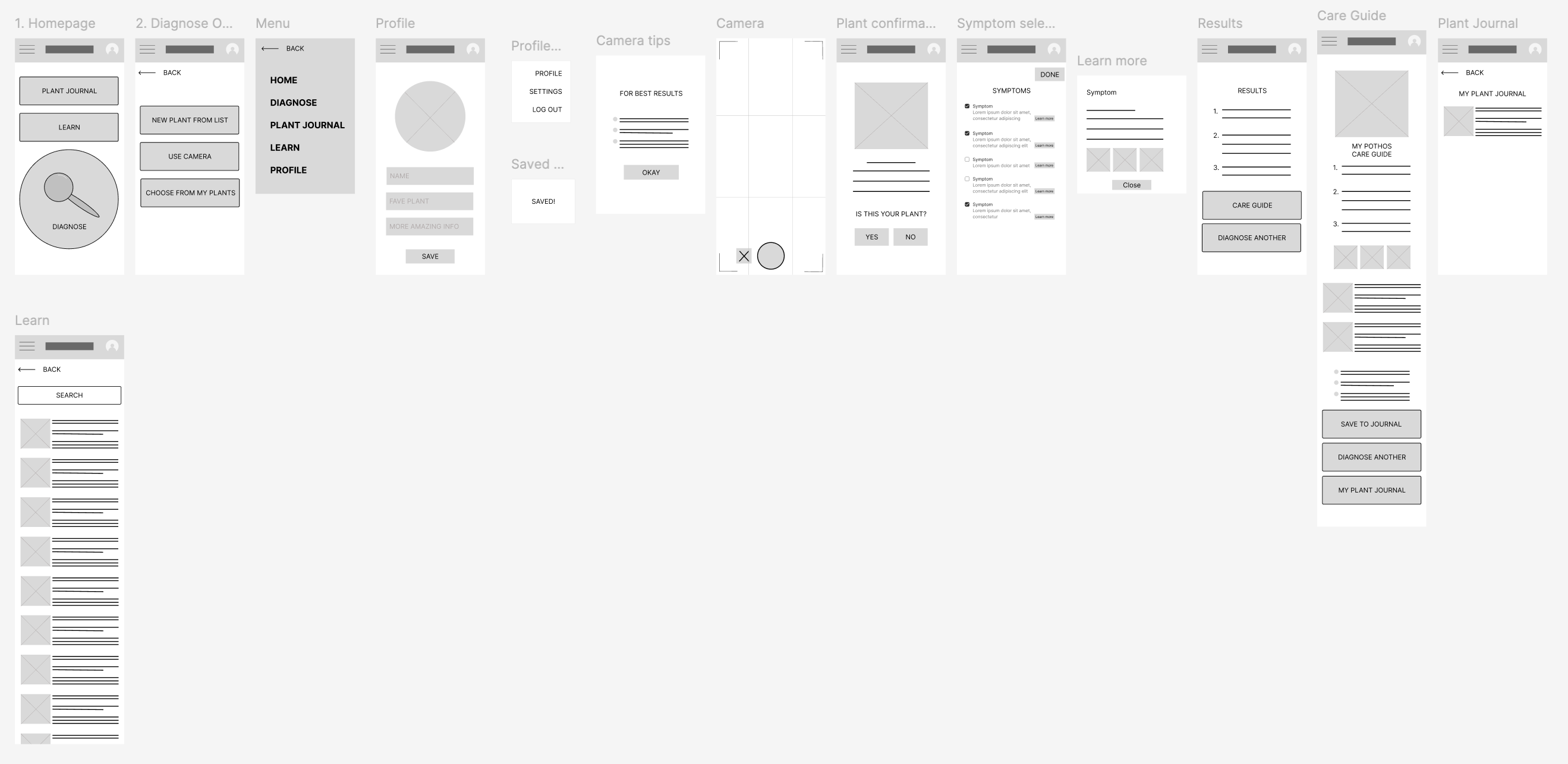
Focused on core functionality of diagnosing houseplant issues
Digital Wireframes
I imported my paper wireframes into figma and began recreating the design. I continued creating the primary user flow.
Usability Study: Round 1
Conducted a moderated usability study with 5 participants.
Research goal:
to figure out what specific difficulties users encounter when they try to complete the core tasks of the plant diagnosing app: diagnose a plant, find their plant, access care guides, save to journal
01
Users afraid of hitting “done”. They felt uncertain if progress saved.
Insight: create more clarifying language for that step.
02
Users expressed wanting more help diagnosing plants.
Insight: Design additional helpful screens and overlays to help guide the user through the diagnose flow.
03
Users felt there was too much info displayed at once.
Insight: Segment the data so it’s easier to digest and scan.
04 // ITERATE
Iterating the Design
Low Fidelity Prototype
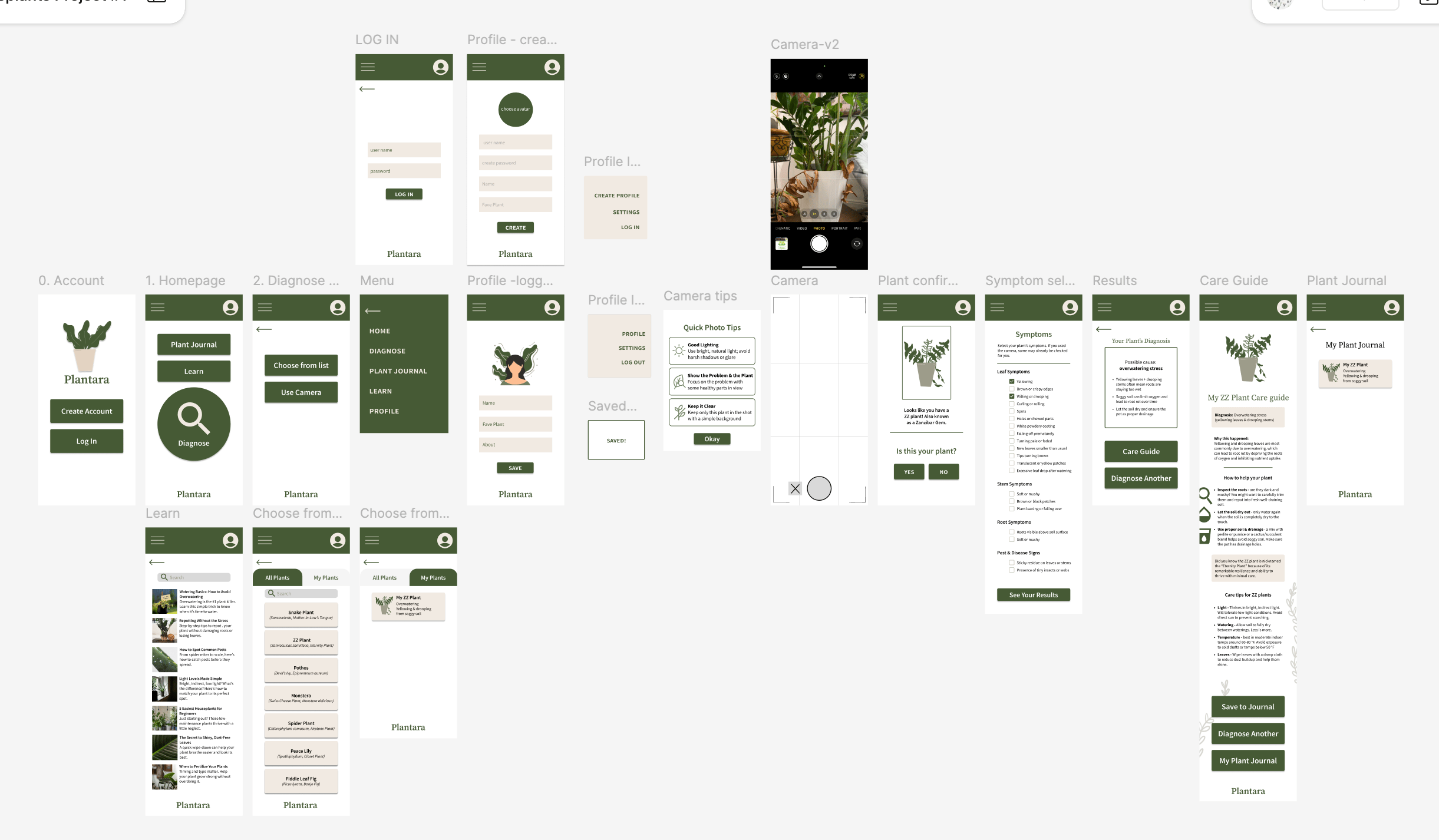
Based on the usability study, I applied design changes. I then incorporated typography, colors, design themes, and imagery to create mockups and then lo-fi prototypes.
Usability Study: Round 2
Conducted a moderated usability study with 5 participants.
Research goal:
to figure out what specific difficulties users encounter when they try to complete the core tasks of the plant diagnosing app: diagnose a plant, find their plant, access care guides, save to journal, then browse the learn guides.
01
Users had difficulty navigating the app.
Insight: design a recognizable bar to help them navigate the app better.
02
Users felt intimidated by the large buttons and multiple CTA’s on journal page.
Insight: Design a FAB for the diagnose function. Remove competing CTA’s. Create a “saved” automatic pop-up when users reach this stage.
03
Users mentioned they weren’t certain what would happen if they selected “learn” on the homepage.
Insight: Incorporate the “learn” page into the navigation and add an icon to assist. Add personalization to the homepage.
High-fidelity Prototypes
Based on insights from the usability study, I applied design changes.
05 // ACCESSIBILITY
Accessibility Considerations
Color & Text Contrast
Colors were tested using WebAIM’s Contrast Checker to ensure text meets WCAG AA or higher.
UI Contrast
Interface components and meaningful visual elements were tested to ensure sufficient contrast.
Typography
Limited the interface to two typefaces, using Source Sans primarily for interface and body text to support readability. Source Serif provides visual distinction for select headings.
Information Hierarchy
Clear typographic hierarchy and structured, scannable layouts make longer content, such as the care guide, easier to navigate and digest.
Clear Interaction States
Buttons and interactive elements provide visual feedback when pressed or selected, while navigation highlights the user’s current location.
Icons + Labels
Navigation combines icons with text labels so users don’t have to rely on icon recognition alone.
Project Reflection
Plantera gave me the opportunity to take a project from initial research through usability testing, iteration, and final design. The process reinforced the importance of testing assumptions early and using user feedback to simplify and strengthen an experience.